


Zephyron
-
Content Count
596 -
Joined
-
Last visited
Posts posted by Zephyron
-
-
fongalv:
I working there mah

And...
*smacks Z_A*

Haiyoh! What you saying!?

-
B2T
At around 5:07pm, Causeway point 1st floor, some gentleman in a black Nike T-Shirt with something that looks like a football club's insignia/logo or something wearing a pair of CK7 not routed over the ear.
Same day, about 7:17pm at Causeway Point 1st floor, a male teenager (I think) wearing a pair of Westones headed towards the basement 1 level of Causeway Point. He was wearing a Billabong T-Shirt.
-
Hmm, to guys interested about the PX200 pads, Stereo Electronics carry them.
Take note that the quarter mod is done on the KSC75 due to its VERY thick foams (IMO), which has some relevance with the percieved higher overall bass quantity and lesser midrange and highs levels as well as detail/clarity levels. With the PX200 pads, this mod is -->NOT<-- necessary, I found that the sponge was so thin it wasn't necessary.
However, do take note that IME, the PX200 pads + KSC75 (without a properly adjusted KSC75 earclip) will sound extremely muddy somewhat, and the answer to that baffles me. I've adjusted the earclip of mine in place already. The things I haven't done's the Tamiya Gloss Black paint on the driver housing and the Kramer dremel EDIT:
midsmods XP -
VERY IMPORTANT
Please Read
*Design student mode: On*
In general, I think we'd better avoid 'insulting' terms that place ourselves at a 'higher plane of sonic superiority' than the average person, even if it were true

If cost weren't an option, the more the words, the better, but I'd like to keep the design of the shirt as simple as possible, and that does include keeping the slogan as short as simple if possible.
Design wise, a high contrast colour would be advisable IMO (Though I recommend against some usual set of Complementary Colours), and the simplest one there are I can think of is:
-black/white
-midnight blue/white
Something more radical would be
-red/white
Easy on the eyes:
-Light blue/white (DO NOT choose CYAN, first word of warning, that colour is hard to go with others irregardless of situation)
Personally, I'd go with midnight blue and white, the contrast between the 2 colours is very powerful and to the eyes can be described as either 'sharp' or 'crisp' to say the least, all in a minimalist package form.
Also, this colour scheme should be able to match the SG headphones logo without much of a hitch if not at all.
As for the quote, I would suggest something simple, understandable and something that doesn't sound arrogant (We don't want to be brushed off as snobs don't we?), so here're a few suggestions from me (I know I'll reek of cheese):
- Aural Bliss / Audio Bliss
- Pure Audio Expression
- Life - Soul - Music
- True Music
- Enjoying Music
- Path to True Audio
- Music Anyone? <- Complements the SGheadphones.net above
- One With My Music
Design Concept:
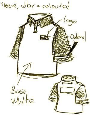
I've done away with the side stripe taking into consideration of costs. To match the coloured sleeves, I strongly suggest that the collars be coloured as well.
Worst Case Scenario:
At most, if everyone cannot conform with a common slogan, I would suggest printing the T-Shirt without any slogan to go with it.
With this in place, one can design their own logotype or choose a suitable font-family to go along with the T-Shirt and either stitch/print it by one's self or go have it done somewhere where such service is provided.
NOTE:
Oh by the way, Yotiao-jie, if you're holding on to the PSD of the SGHP logo, could you mail it to me here?
» Click to show Spoiler - click again to hide... «zephyron_mkii@yahoo.com -
OT: Remember that nicks would cost more to print/stitch though. We'd best leave it optional and people who want them on can put it on by themselves...
Errr... You guys CAN stitch right? I hope...
Anyways, don't reply here, but use the T-Shirt thread instead =D
-
Looks interesting... Wonder how well it'll work
-
This will OT leh XD
As part-timer, got no special privilige to give anyone discount x_X
Still the same 1 box of 4 reg size for 10% off and 2 reg size boxes = 10% off + SG$5 voucher to be used for next purchase, same for all our outlets islandwide I think.
Nice meeting some of you over there today too (though I'm not sure who's who). Wish there were more people around though, really wanted to talk more about the T-shirt design...
... ...
I feel like an OT-king >.>;;
-
^
Haiyoh, I not rich lah, part-timer only
Anyways, today around 1825hrs outside City Hall MRT Station's bus stop, saw a guy wearing a white pair of PX100.
-
you work there right?

o_O;;
Now how did you know!?!?
You must be psychic
-
Bose Triport at Causeway Point, near the Bengawan Solo mooncake kiosk at about 5-6pm.
-
Off topic but, would you guys going down to Jaben later wanna talk about the T-Shirt design?
I'll probably be arriving at 6pm + a little bit to wait up for zhapchit.
-
I spent $49 on them before, found them worth it.
Its quite a lot of sound for a relatively low price.
IMO, bass maybe a bit loose (unfair, comparing to E4), but quite well extended (rolls off a bit early). A bit of bass emphasis, EDIT:
butand has a bit of a splashy treble that can still be lived with. Midrange isn't to die for, but is very well acceptable.Details aren't exxagerated, a bit masked one can say, but is fine (liveable with, considering the price), the ER4P is faster to my ears and the E4 is a little faster than it, but its by no means a slow phone. I think semi-fast counts.
By any means, in terms of budget, it easily dethrones the EP630 and LMX-E630 IMO, but then again, I don't think its a fair comparison.
Thought I didn't need them so I sold them, but in the end buying back again but this time for a cheaper price.
...
Function + modding time >=D
Soon-to-be KSC75 ver Zeph:
KSC75 + Tamiya gloss black paint + Kramer modding + PX200 Pads
-
Shoulda had a mirror finish IMO, it'll look nicer on it
-
...
They badly need a new designer IMO x_X
-
' date='27 Sep 2006, 11:45 AM' post='80552']But I definitely cannot do a nice job as I have too much work to do here..
Sigh..

*smacks your bum with a leather whip*
No excuses, we've all got work >=D
-
I suggest not.
It will look cluttered, believe me x_X
-
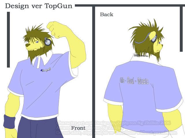
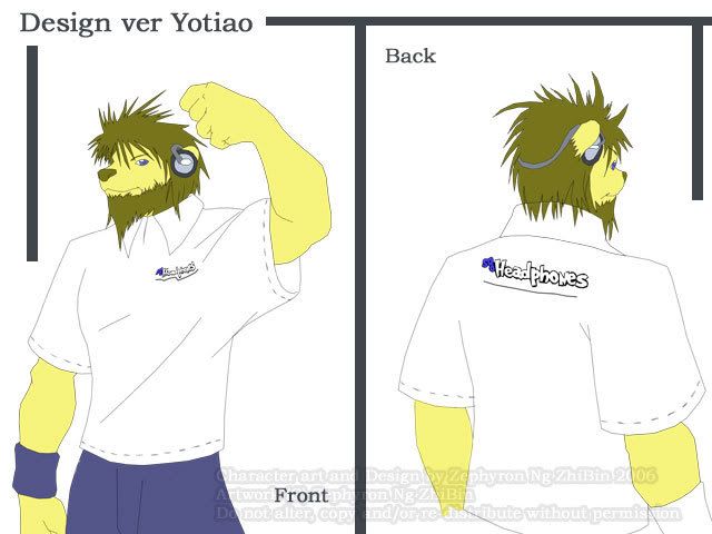
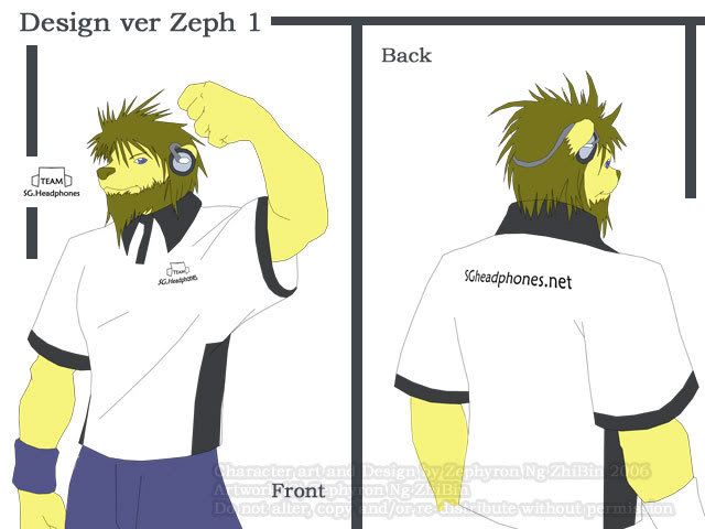
Okay, I chose to do up designs for Top-Guns, Yotiao's and both of mine respectively.
Reason why I chose them is due to simplicity in design, little words included and overall possible high contrast when worn with standard blue jeans.
Its a flat colour rush job, don't have time to go into details and all that, but its the base colour one'd expect when wearing them.
Do take note that as a fashion sense, the pants that will match the colour of the T-Shirt is very important.
Err, I didn't want to draw any particular person as a model here so... here comes the country's non-legendary form mascot to the rescue! Hear the lion roar!
......
*reeks of cheese*
Okay okay, down to business.
First up, we've got Top-Gun's forum colour scheme, IMO, its quite matching apparently. This is one reason I do not want to keep the URL on the back of the collar -> Possibility of medium-long hair covering it:
Next up is Yotiao's, its simple but quite nice (no slogan yet):
Next is my first design, simple high-contrast taken into consideration, made my own logotype (which Xian Yi can probably refine)[No slogan yet]:
Similar to above design, but with URL placed higher up for backpackers:

-
I think its best we decide on the T-Shirt type first and then come up with a logo to match the shirt.
The logotype and typography in play is very important.
Xian Yi, after a T-shirt model is picked, I think we'd best leave the logo design to you. I'll provide feedback when you're online
-
Roasty, I'm currently pre-occupied with some CG works.
By when would you need the T-Shirt designs up?
EDIT - Add:
Also, in PSD format, what resolution would you need?
Any kinda specific measurements that you want for the possibly included logotypes/design?
I'll probably do some preliminary quick drawings of different shirts designs being worn if possible.
-
One man's meat is another man's poison.
I'd recommend trying them out yourself in either SE or Jaben.
-
' date='24 Sep 2006, 11:47 PM' post='80223']For the back part, I was thinking of using a whole bunch of smileys going down from the first smiley, sort of like a backbone to the shirt.
Believe me, you won't want this.
It can really distracting and detracting.
-
Can we add a "Sorry about your wallet..." somewhere as a "footnote" along the bottom left/right edge of the shirt(near the trims)

*smacks j00*
Shhhh!
-
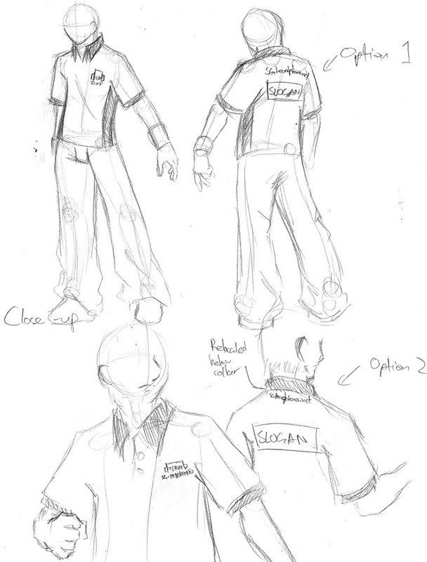
To keep things simple and to have less words on the shirt to avoid what we call eye confusion, I came up with Option 2 where I think we should have SGheadphones.net should be moved upwards slightly below the back collar area (It should be smaller than what it is in the pic as well, I couldn't smallify it further without it being illegible during the scan).
Below it around the middle of the shoulderblade area is where the Slogan should be located. The lesser the words the better IMO.
-
*refrains from going into design mode*
Too much deco is more of a distraction than anything however.
Simplicity and power in a T-shirt IMO should be achieved using simple colours whilst at the same time minimizing the decorations placed onto the T-shirt.
By adding earphones/headphones/other audio gear, it feels as if that the T-shirt is some form of advertising item rather than being like, I dunno, SGheadphones in itself in general.
*stops his current colouring work*
I'll get down to drawing first ya?
Headphone/Earphone Sightings
in The Lounge Lizard
Posted · Report reply
*takes a break from CG work*
Hmm, Causeway Pt 1st floor outside the Lee Hwa (?) jewellery shop, about 1739 hrs or so.
Guy at wearing dark beige sweater and jeans wearing a pair of black Cresyn LMX-E630. He was with (I think, and no, Z_A, its definitely a he here, though I'm not referring to what I'm gonna say next ) some girl I'm assuming to be his girlfriend (pretty cute o_O).
*back to work*